Three Good Websites
This second post focuses on three websites that I believe have good design.
The Delegate Wranglers
The Delegate Wranglers is a community in the events industry that helps organisers and suppliers connect, by providing an online platform – their website – where professionals can go and find whoever they may need. I consider the design of their website to be good because of the simple yet complex design. The colour palette they use consists of five colours – black, grey, white, green and red – with the primary colours being black, grey and white, and green and red for creating accents in text or design. By choosing those simple colours, users can easily read through the information without getting distracted by bright and colourful text or graphics. The graphics and images are also kept to a minimum by including them only when necessary to avoid further confusion. For example, the only graphic on the welcome page is their logo and the images that are used are only to showcase their members either by including a picture of an individual or a company’s logo/team.
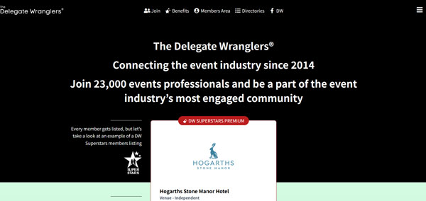
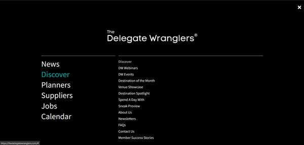
Navigating the website is also made easy with simple design and wording. For example, when using the menu in the top right corner by hovering over a main category the text turns from white to green, to show the user which category they have selected. There are also subcategories that show when the user hovers over a main category which can help narrow down their search results.
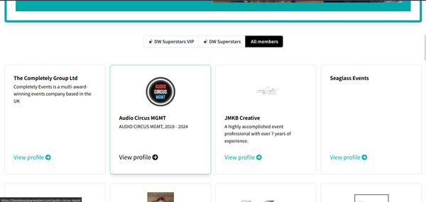
Lastly, when going through a list of companies or individuals, they are neatly presented in grid view across the width of the page to optimise the available space. Further, when hovering over a specific profile there is a slight visual change that helps when navigating. The colour and size of the link to the full profile change from green to black and becomes slightly bigger. The border of the profile changes from grey to green and a little shadowing appears, creating the illusion that that specific profile moves forward towards the user.
University of Greenwich
The second website I believe to have a good design is the University of Greenwich official website. The colour palette here is also simple and appealing, using white, black, and different shades of grey and blue to create separation between different categories and sections of the website.
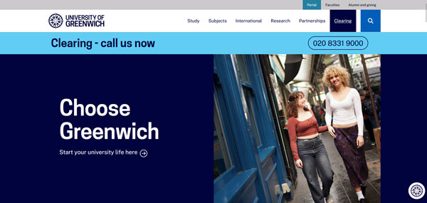
The wording that is used is clear to understand and makes it easy for the user to find what they need without confusion. Because this website needs to communicate different types of information depending on the user, appealing images and design are used to create differentiation to further help the user navigate towards the section they are looking for, while still keeping the main topic categories at the top of the screen.
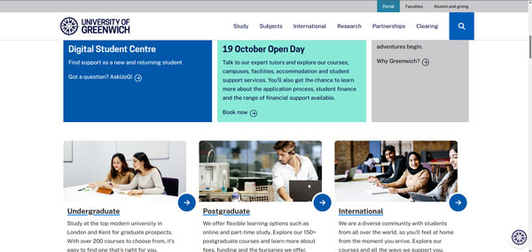
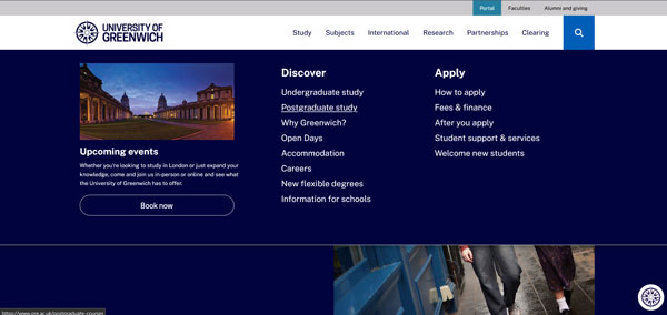
The main menu at the top of the page is also well-designed. The main categories are shown and when the user hovers over one of them, the wording becomes underlined and further subcategories appear to help narrow down their search results. A subcategory also becomes underlined when hovered over, further assisting in user navigation.
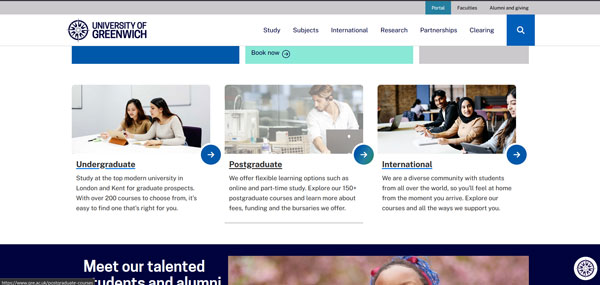
To assist with navigation, when browsing through this website when the user hovers over the text link to a category, underlines appear indicating the selected text link. Similarly, when hovering over the image link to a category, the image changes appearance and becomes semi-transparent.
Netflix
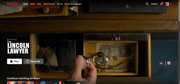
The last good website in my opinion is Netflix‘s website for existing subscribers. Upon opening the home page is engaging and attracts attention by showing a suggestion for a film or series the user might like to watch. The title is clear and big on the bottom left along with smaller in size buttons to ‘Play’ the show or get ‘More info’ about it, while as a background across the whole screen size a video trailer is played. The logo, main menu, search bar, profile setting and notifications are positioned at the top without a background colour to allow more space for the trailer to be played. The option to turn on/off the volume of the trailer and the age restriction are positioned at the bottom right corner providing quick and easy access to both.
After scrolling down past the landing section of the website the user gets personalised suggestions on shows to watch based on category or previously watched film and series and section to continue watching one that they have already started. Their layout is in rows with a grid view, showing the shows’ image and title in a rectangular shape. There is a very useful feature with which after hovering over a specific show, the rectangular slightly expands on the screen and a trailer begins to play. The title is still displayed at the bottom left corner, the sound on/off button is positioned in the bottom right corner, and an additional section is displayed where the user can see its genre categories, number of seasons or episodes/duration hours and age restriction. Four buttons lead to different actions. When pressed the first one starts playing the show and automatically adds it to the ‘Currently watching’ section, the next button gives the option to add the show to a wish list, and using the third button the user can rate the show.
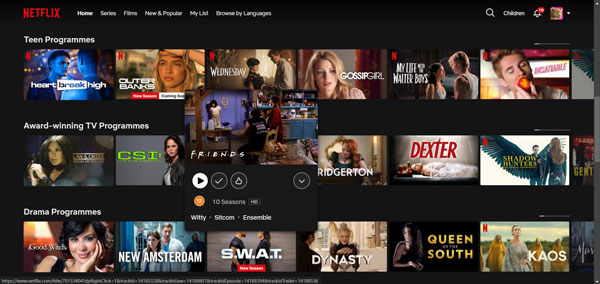
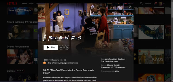
The last one (the arrow down) further expands the show providing a larger view of the show with an overall show description and separate descriptions of each episode if it is a series, a list of the main actors and some more detailed information about the show.
All these features make the website very simple and easy to navigate, creating a seamless user experience, therefore making it a good website.